第83期 cowplot包进行拼图及注释
本期介绍R语言cowplot包的效果和详细教程
个人觉得是目前最好的R语言拼图包
内容主要基于包的完全文档的翻译和笔记
第四部分详细功能展示非常详细,有需要的朋友可以先不看,或者找有时间的时候看。公众号不支持目录跳转,所以导出推文全文为PDF,后台回复“240329”获取
Cowplot安装
# 安装CRAN版本
install.packages("cowplot")

#安装较新版本
remotes::install_github("wilkelab/cowplot")
Cowplot粗略介绍
cowplot包提供了各种功能,帮助创建满足出版质量的图形,例如一套修改主题、对齐图形和将它们排列成复杂的复合图形的函数,以及简化图形注释和混合图形与image的功能。
主题
cowplot最初是为了提供一个简单、干净的主题,类似于 ggplot2 的 theme_classic()。然而,随着软件包功能的增加,这种选择越来越成问题,因此从 1.0 版开始,cowplot 不再改变默认的 ggplot2 主题。
重要的是,cowplot 软件包现在提供了一组具有不同功能的互补主题。不存在一个适用于所有图形的单一主题,建议绘制每幅图时都明确设置一个主题。
# classic cowplot theme
ggplot(iris, aes(Sepal.Length, Sepal.Width, color = Species)) +
  geom_point() +
  theme_cowplot(12)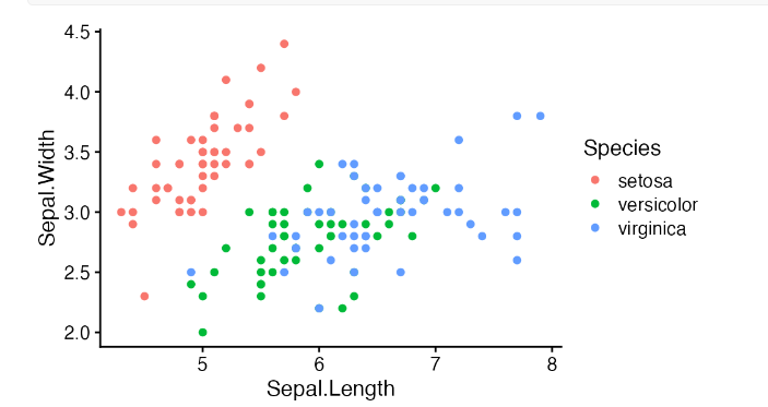
用网格来排版拼接图形
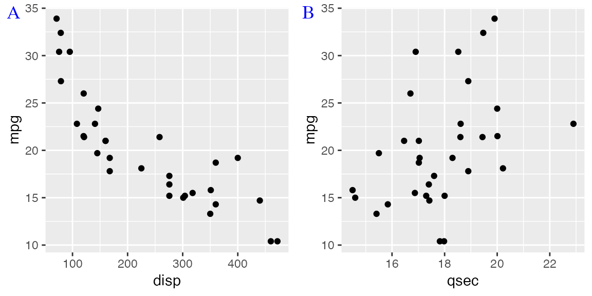
cowplot 软件包提供了 plot_grid()函数,用于将绘图排列成网格并贴上标签。
p1 <- ggplot(mtcars, aes(disp, mpg)) +
  geom_point()
p2 <- ggplot(mtcars, aes(qsec, mpg)) +
  geom_point()

plot_grid(p1, p2, labels = c('A', 'B'), label_size = 12)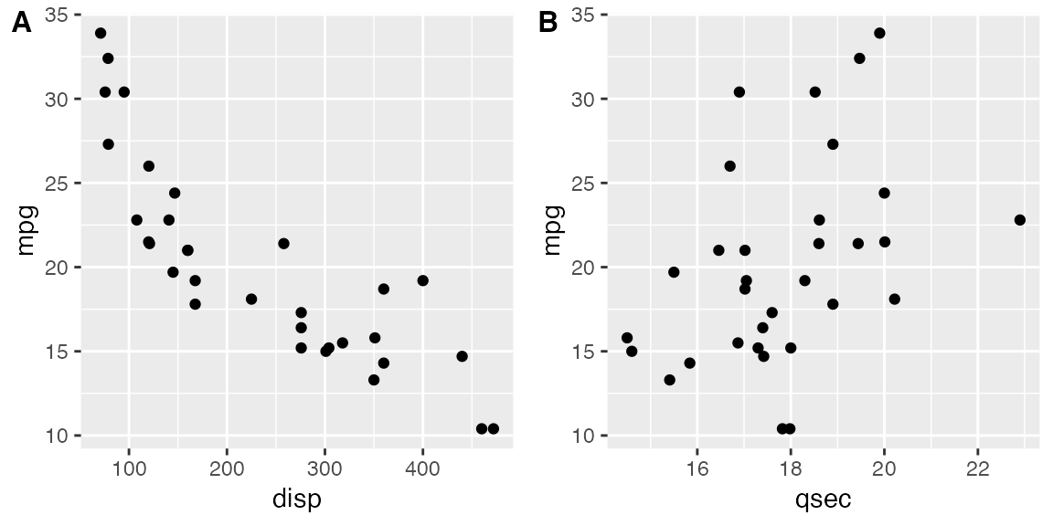
plot_grid() 最初是为 ggplot2 编写的,但它也支持其他绘图框架,如 base graphics。
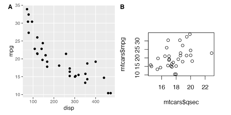
添加图形文字或图形标注
plot_grid() 建立在通用绘图层之上,它允许我们以图像的形式捕捉绘图,然后在绘图中或绘图之上绘图
p <- ggplot(mtcars, aes(disp, mpg)) +
  geom_point(size = 1.5, color = "blue") +
  theme_cowplot(12)

logo_file <- system.file("extdata", "logo.png", package = "cowplot")

ggdraw(p) +
  draw_image(logo_file, x = 1, y = 1, hjust = 1, vjust = 1, width = 0.13, height = 0.2)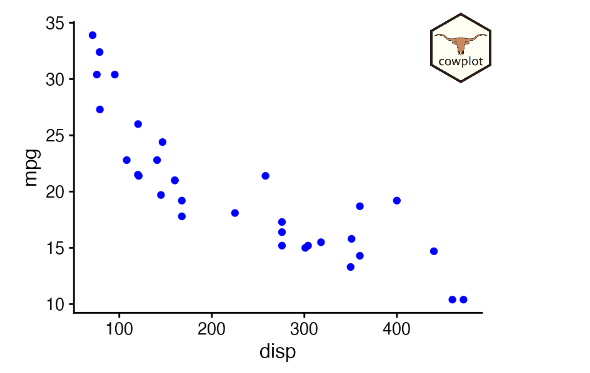
在这里,ggdraw() 会获取绘图的快照,并以全尺寸将其放入一个新的绘图画布中。然后,函数 draw_image() 会在绘图上绘制图像。
要创建水印,我们可以颠倒顺序,先设置一个空的绘图画布,然后绘制图像,再在上面绘制绘图。
ggdraw() +
  draw_image(logo_file, scale = 0.5) +
  draw_plot(p)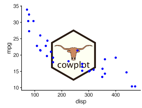
Cowplot函数展示
图形组合
| 函数 | 描述 |
|---|---|
| align_margin() | 沿指定边距对齐多个图形 |
| align_plots() | 垂直和/或水平对齐多个图形 |
| plot_grid() | 将多个图形排列成网格 |
绘图
| 函数 | 描述 |
|---|---|
| draw_figure_label() | 为图形添加标签 |
| draw_grob() | 绘制grob |
| draw_image() | 绘制图像 |
| draw_label() | 绘制文本标签或数学表达式 |
| draw_line() | 用连接点绘制线条 |
| draw_plot() | 绘制(子)图形 |
| draw_plot_label() | 为图形添加标签 |
| draw_text() | 一次性绘制多个文本字符串 |
| stamp(), stamp_good(), stamp_bad(), stamp_wrong(), stamp_ugly() | 用标签(如好、坏、错误、丑)标记图形 |
主题
| 函数 | 描述 |
|---|---|
| theme_cowplot(), theme_half_open() | 创建默认的cowplot主题 |
| theme_map() | 创建绘制地图的主题 |
| theme_minimal_grid(), theme_minimal_vgrid(), theme_minimal_hgrid() | 带网格的极简主题 |
| theme_nothing() | 创建一个完全空白的主题 |
获取方法
| 函数 | 描述 |
|---|---|
| get_legend() | 检索图形的图例 |
| get_panel(), get_panel_component() | 检索图形的面板或面板的一部分 |
| get_plot_component(), plot_component_names(), plot_components() | 获取图形组件 |
| get_title(), get_subtitle() | 获取图形标题 |
| get_y_axis(), get_x_axis() | 获取图形的轴线 |
Grobs
| 函数 | 描述 |
|---|---|
| gtable_remove_grobs() | 从gtable中移除命名元素 |
| gtable_squash_cols(), gtable_squash_rows() | 将给定列/行的尺寸设置为0 |
| as_grob(), as_gtable(), plot_to_gtable() | 将图形或其他图形对象转换为gtable或grob |
输出
| 函数 | 描述 |
|---|---|
| ggsave2() | Cowplot对ggsave()的重新实现 |
| save_plot() | ggsave()的替代品,对多图形图表支持更好 |
| png_null_device(), pdf_null_device(), cairo_null_device(), agg_null_device() | 空设备 |
| set_null_device() | 设置空图形设备 |
Cowplot功能详细展示
在网格中拼图
基础用法
plot_grid() 函数提供了一个简单的界面,用于将图形排列成网格并添加标签。
library(ggplot2)
library(cowplot)
p1 <- ggplot(mtcars, aes(disp, mpg)) +
geom_point()
p2 <- ggplot(mtcars, aes(qsec, mpg)) +
geom_point()
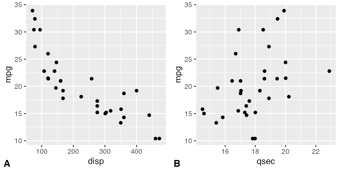
plot_grid(p1, p2, labels = c('A', 'B'))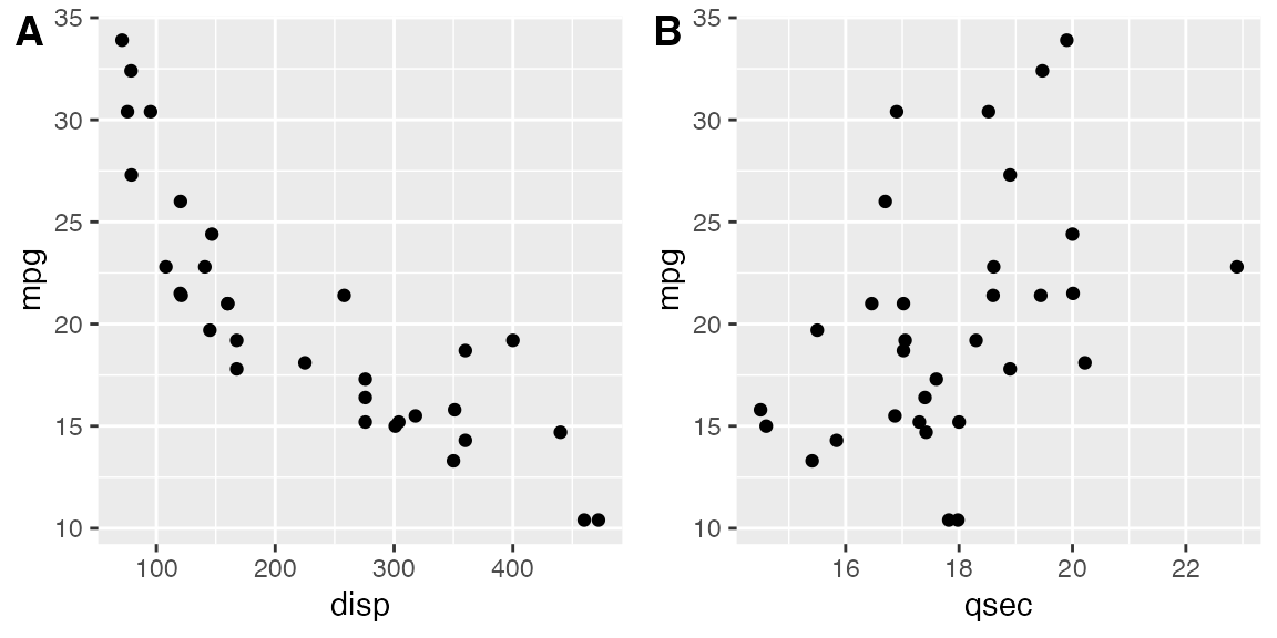
如果指定标签为 labels = "AUTO" 或 labels = "auto",则标签将分别以大写或小写自动生成。
plot_grid(p1, p2, labels = "AUTO")
plot_grid(p1, p2, labels = "auto")
默认情况下,绘图不会对齐,但在很多情况下,可以通过对齐选项对齐。
p3 <- p1 +
  # use large, rotated axis tick labels to highlight alignment issues
  theme(axis.text.x = element_text(size = 14, angle = 90, vjust = 0.5))

# plots are drawn without alignment
plot_grid(p3, p2, labels = "AUTO")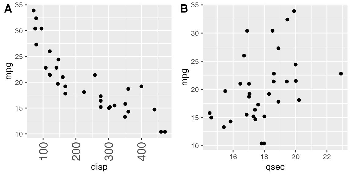
# plots are drawn with horizontal alignment
plot_grid(p3, p2, labels = "AUTO", align = "h")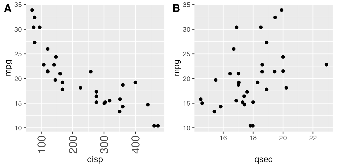
如果需要更复杂的绘图排列或其他特殊效果,可能需要在对齐参数之外指定轴参数。
函数 plot_grid() 可以处理各种不同类型的绘图和图形对象,而不仅仅是 ggplot2 绘图。有关详情,请参阅混合使用不同绘图框架的小节。不过,只有 ggplot2 绘图才支持对齐绘图
微调绘图网格
您可以通过 label_size 选项调整标签大小。默认值为 14,因此数值越大标签越大,数值越小标签越小。
plot_grid(p1, p2, labels = "AUTO", label_size = 12)
您还可以调整标签的字体族、字面和颜色。
plot_grid(
  p1, p2,
  labels = "AUTO",
  label_fontfamily = "serif",
  label_fontface = "plain",
  label_colour = "blue"
)
标签可以通过 label_x 和 label_y 参数移动,通过 hjust 和 vjust 参数对齐。例如,要将标签置于左下角,可以写入
plot_grid(
  p1, p2,
  labels = "AUTO",
  label_size = 12,
  label_x = 0, label_y = 0,
  hjust = -0.5, vjust = -0.5
)
通过向选项 label_x、label_y、hjust 和 vjust 传递调整值向量,可以逐个调整各个标签(示例未显示)。
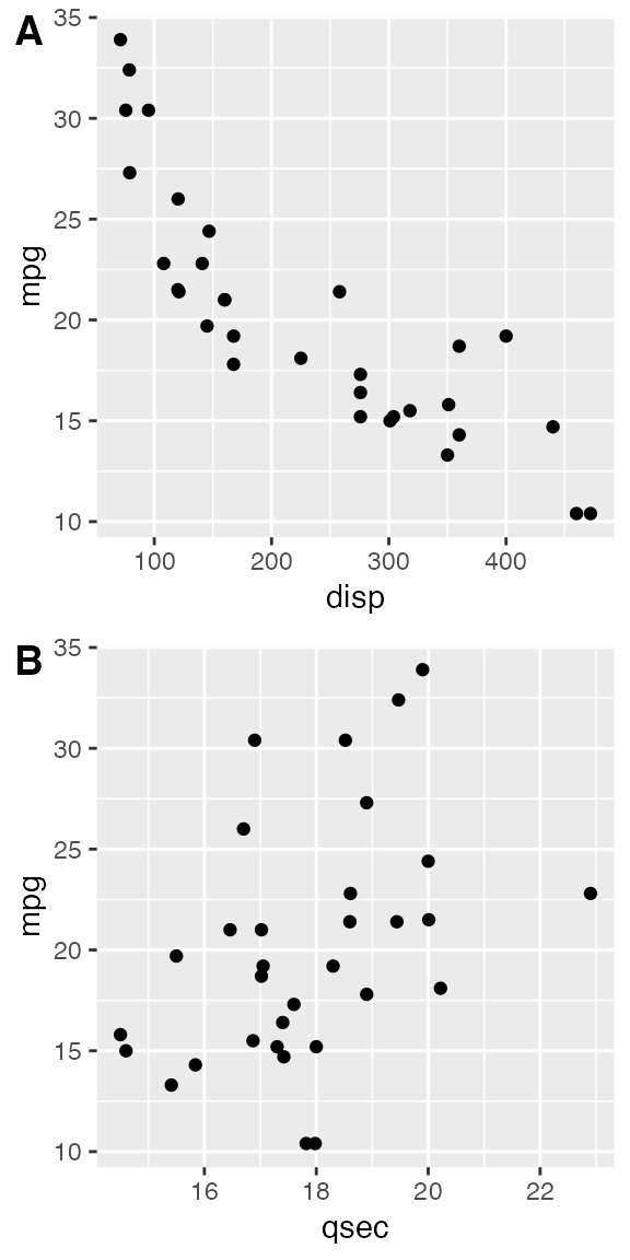
可以通过 nrow 和 ncol 指定绘图网格的行数和列数。
# arrange two plots into one column
plot_grid(
  p1, p2,
  labels = "AUTO", ncol = 1
)
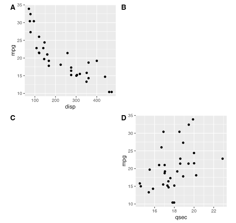
参数 NULL 可用来表示网格中缺少的图块。请注意,如果开启了自动标注功能,缺失的绘图将被标注。
# the second plot in the first row and the
# first plot in the second row are missing
plot_grid(
  p1, NULL, NULL, p2,
  labels = "AUTO", ncol = 2
)
行和列的相对宽度和高度可以通过 rel_widths 和 rel_heights 参数进行调整。
plot_grid(p1, p2, labels = "AUTO", rel_widths = c(1, 2))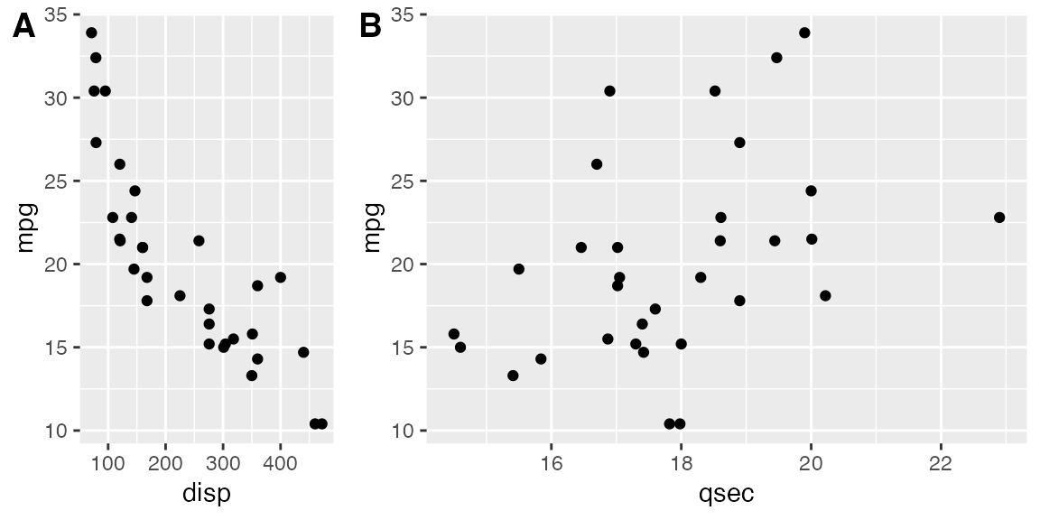
嵌套绘图网格(拼图后再拼图)
如果想生成一种非简单网格的图形排列,可以将一个 plot_grid() 图形插入到另一个图形中。
bottom_row <- plot_grid(p1, p2, labels = c('B', 'C'), label_size = 12)
p3 <- ggplot(mtcars, aes(x = qsec, y = disp)) + geom_point() + facet_wrap(~gear)

plot_grid(p3, bottom_row, labels = c('A', ''), label_size = 12, ncol = 1)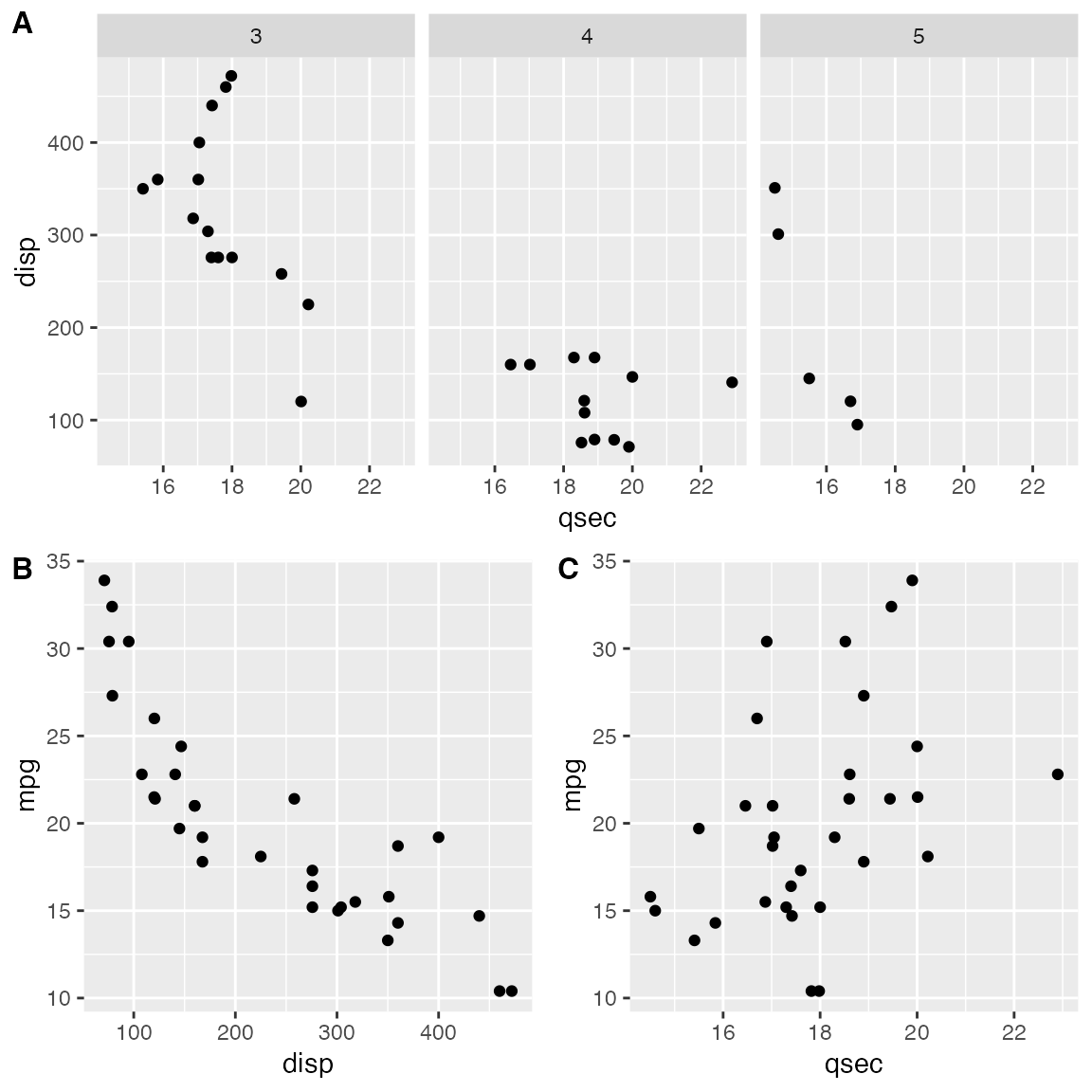
在这种情况下,对齐可能有点麻烦。不过,通常可以通过显式调用 align_plots()来实现。诀窍在于,首先使用 align_plots() 函数沿左坐标轴垂直对齐顶行图(p3)和第一个底行图(p1)。然后将这些对齐的绘图传递给 plot_grid()。
# first align the top-row plot (p3) with the left-most plot of the
# bottom row (p1)
plots <- align_plots(p3, p1, align = 'v', axis = 'l')
# then build the bottom row
bottom_row <- plot_grid(plots[[2]], p2, labels = c('B', 'C'), label_size = 12)

# then combine with the top row for final plot
plot_grid(plots[[1]], bottom_row, labels = c('A', ''), label_size = 12, ncol = 1)
拼图合用标题
当我们使用 plot_grid() 组合图形时,可能希望添加一个横跨整个组合图形的标题。虽然 cowplot 中没有特定的函数来实现这种效果,但只需几行代码就能轻松模拟:
# make a plot grid consisting of two panels
p1 <- ggplot(mtcars, aes(x = disp, y = mpg)) +
  geom_point(colour = "blue") +
  theme_half_open(12) +
  background_grid(minor = 'none')

p2 <- ggplot(mtcars, aes(x = hp, y = mpg)) +
  geom_point(colour = "green") +
  theme_half_open(12) +
  background_grid(minor = 'none')

plot_row <- plot_grid(p1, p2)

# now add the title
title <- ggdraw() +
  draw_label(
    "Miles per gallon decline with displacement and horsepower",
    fontface = 'bold',
    x = 0,
    hjust = 0
  ) +
  theme(
    # add margin on the left of the drawing canvas,
    # so title is aligned with left edge of first plot
    plot.margin = margin(0, 0, 0, 7)
  )
plot_grid(
  title, plot_row,
  ncol = 1,
  # rel_heights values control vertical title margins
  rel_heights = c(0.1, 1)
)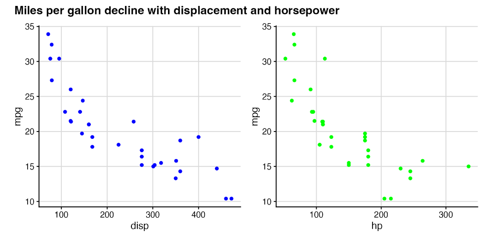
在最后的 plot_grid 行中,需要适当选择 rel_heights 的值,以便标题周围的边距看起来正确。根据此处选择的值,标题占绘图总高度的 9%(即 0.1/1.1)。
图形合用图例
本小节演示如何绘制带有共享图例的复合图。
我们首先绘制一排不带图例的三幅图。
library(ggplot2)
library(cowplot)
library(rlang)

# down-sampled diamonds data set
dsamp <- diamonds[sample(nrow(diamonds), 1000), ]

# function to create plots
plot_diamonds <- function(xaes) {
  xaes <- enquo(xaes)
  ggplot(dsamp, aes(!!xaes, price, color = clarity)) +
    geom_point() +
    theme_half_open(12) +
    # we set the left and right margins to 0 to remove
    # unnecessary spacing in the final plot arrangement.
    theme(plot.margin = margin(6, 0, 6, 0))
}

# make three plots
p1 <- plot_diamonds(carat)
p2 <- plot_diamonds(depth) + ylab(NULL)
p3 <- plot_diamonds(color) + ylab(NULL)

# arrange the three plots in a single row
prow <- plot_grid(
  p1 + theme(legend.position="none"),
  p2 + theme(legend.position="none"),
  p3 + theme(legend.position="none"),
  align = 'vh',
  labels = c("A", "B", "C"),
  hjust = -1,
  nrow = 1
)
prow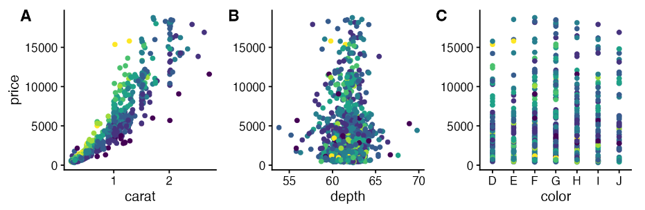
现在我们手动添加图例。我们可以将图例放在绘图的一侧。
# extract the legend from one of the plots
legend <- get_legend(
  # create some space to the left of the legend
  p1 + theme(legend.box.margin = margin(0, 0, 0, 12))
)

# add the legend to the row we made earlier. Give it one-third of
# the width of one plot (via rel_widths).
plot_grid(prow, legend, rel_widths = c(3, .4))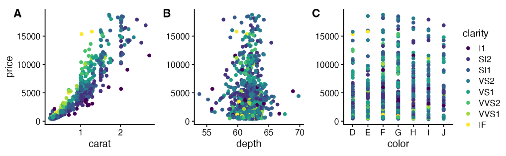
我们也可以将图例放在底部。
# extract a legend that is laid out horizontally
legend_b <- get_legend(
  p1 +
    guides(color = guide_legend(nrow = 1)) +
    theme(legend.position = "bottom")
)

# add the legend underneath the row we made earlier. Give it 10%
# of the height of one plot (via rel_heights).
plot_grid(prow, legend_b, ncol = 1, rel_heights = c(1, .1))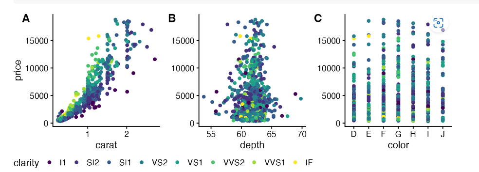
或者把图例放中间
# arrange the three plots in a single row, leaving space between plot B and C
prow <- plot_grid(
  p1 + theme(legend.position="none"),
  p2 + theme(legend.position="none"),
  NULL,
  p3 + theme(legend.position="none"),
  align = 'vh',
  labels = c("A", "B", "", "C"),
  hjust = -1,
  nrow = 1,
  rel_widths = c(1, 1, .3, 1)
)

# now add in the legend
prow + draw_grob(legend, 2/3.3, 0, .3/3.3, 1)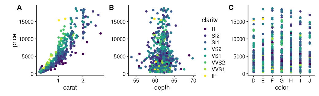
或者来个复杂的排版看看
# plot 1
p1 <- ggplot(iris, aes(Sepal.Length, Sepal.Width, color = Species)) +
  geom_point() +
  stat_smooth(method = "lm") +
  facet_grid(. ~ Species) +
  theme_half_open(12) +
  background_grid(major = 'y', minor = "none") +
  panel_border() +
  theme(legend.position = "none")

# plot 2
p2 <- ggplot(iris, aes(Sepal.Length, fill = Species)) +
  geom_density(alpha = .7) +
  scale_y_continuous(expand = expansion(mult = c(0, 0.05))) +
  theme_half_open(12) +
  theme(legend.justification = "top")
p2a <- p2 + theme(legend.position = "none")

# plot 3
p3 <- ggplot(iris, aes(Sepal.Width, fill = Species)) +
  geom_density(alpha = .7) +
  scale_y_continuous(expand = c(0, 0)) +
  theme_half_open(12) +
  theme(legend.position = "none")

# legend
legend <- get_legend(p2)

# align all plots vertically
plots <- align_plots(p1, p2a, p3, align = 'v', axis = 'l')

# put together the bottom row and then everything
bottom_row <- plot_grid(
  plots[[2]], plots[[3]], legend,
  labels = c("B", "C"),
  rel_widths = c(1, 1, .3),
  nrow = 1
)
plot_grid(plots[[1]], bottom_row, labels = c("A"), ncol = 1)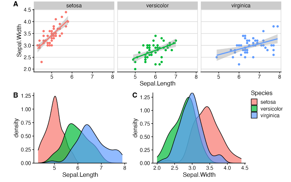
设置主题
基础使用
主题 theme_half_open()(或等价主题 theme_cowplot())提供了一种经典的双轴线、无背景网格的图形外观。该主题适用于大多数类型的图形,但最适合散点图和折线图。
library(ggplot2)
library(cowplot)

p <- ggplot(mtcars, aes(disp, mpg)) + geom_point()

p + theme_half_open() # identical to theme_cowplot()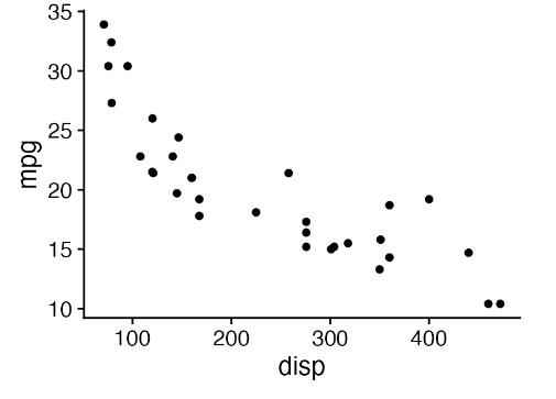
如果您喜欢背景网格,可以通过标准 ggplot2 主题选项添加。或者,也可以使用 cowplot 函数 background_grid()。这个函数需要放在主题调用之后,因为主题调用会覆盖之前所有的主题设置。
p +
  theme_half_open() +
  background_grid() # always place this after the theme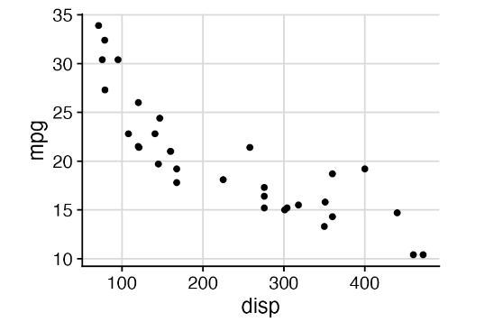
如果您喜欢带有网格且不带轴线的极简外观,请使用 theme_minimal_grid()。
p + theme_minimal_grid()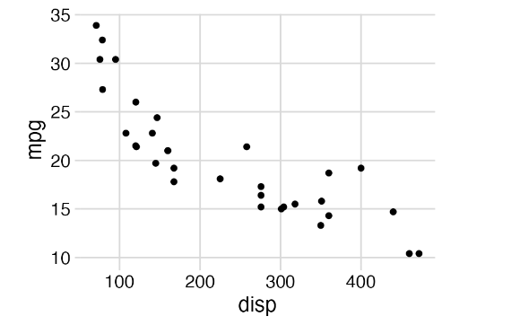
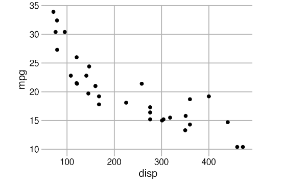
所有主题都可以进一步自定义。例如,默认字体大小为 14 号,适合 5 到 8 英寸宽的数字。对于较小的数字,您可能需要使用 12 号字体。此外,我们还可以修改 theme_minimal_grid() 中网格线的颜色。
p +
  theme_minimal_grid(
    font_size = 12,
    color = "grey70"
  )
根据图形类型来选择不同绘图
在选择绘图主题时,应始终注意它在特定绘图中的作用。例如,如果您正在绘制条形图,theme_half_open() 会因为 ggplot2 的自动轴扩展(即 x 轴线不在 y = 0 处)而生成难看的浮动条形图。
p <- ggplot(mtcars, aes(factor(cyl))) +
  geom_bar(fill = "#56B4E9", alpha = 0.8) +
  theme_half_open()

stamp_ugly(p)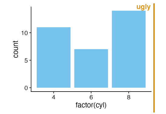
去除条形图低端和x轴的间距是不是好看很多啦
p <- ggplot(mtcars, aes(factor(cyl))) +
  geom_bar(fill = "#56B4E9", alpha = 0.8) +
  scale_y_continuous(
    # don't expand y scale at the lower end
    expand = expansion(mult = c(0, 0.05))
  )

p + theme_half_open()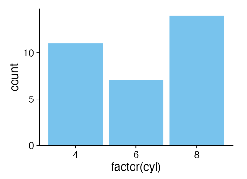
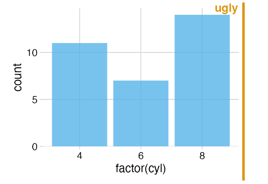
条形图在背景网格上看起来也很别扭,我建议不要使用条形图。
stamp_ugly(
  p + theme_minimal_grid()
)
您可以使用 theme_minimal_hgrid(),它只会绘制水平网格线。
p + theme_minimal_hgrid()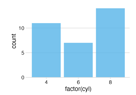
如果使用水平条形图绘制翻转条形图,则可能需要垂直网格线,这可以通过 theme_minimal_vgrid() 获得。
p +
  coord_flip() +
  theme_minimal_vgrid()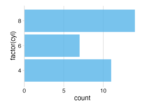
分面主题
在分面时需要特别注意。一个主题可能在单个情节中看起来很好,但在分面情节中却效果不佳。举个例子,看看我们使用 theme_half_open() 进行分面时会发生什么。
p <- ggplot(mtcars, aes(disp, mpg)) +
  facet_wrap(~factor(cyl)) +
  geom_point() +
  theme_half_open(12)

stamp_ugly(p)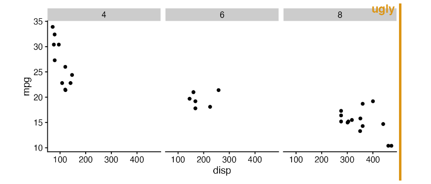
由于 ggplot2 不会重复每个面板的 Y 轴线,因此三个面板在视觉上并没有分开。我们可以通过调用标准 ggplot2 主题或使用便捷函数 panel_border(),在每个面板周围绘制边框,从而改善这种情况。与 background_grid()一样,该函数必须放在主题之后。
p + panel_border() # always place this after the theme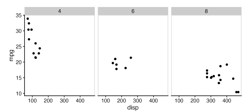
在这种特殊情况下,也许同时使用面板边框和背景网格是最好的选择。
p +
  panel_border() +
  background_grid()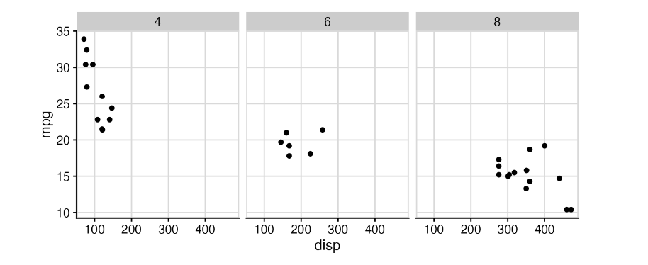
空主题
theme_map() 和 theme_nothing() 这两个主题提供了不带坐标轴的精简主题。 theme_map() 类似于 ggplot2 中的 theme_void(),它保留了绘图标题、副标题、标题和图例,只是删除了坐标轴刻度、线条、标签和网格线。所有设置都与其他 cowplot 主题相匹配,因此您可以将使用 theme_map() 的绘图与其他 cowplot 主题混合使用,而且它们看起来会保持一致。
为了演示这些主题是如何工作的,以及它们是如何与提供的其他主题交互的,让我们先制作一个包含标题、副标题、标题和图例的标准散点图。
p <- ggplot(mtcars, aes(disp, mpg, color = wt)) +
  geom_point() +
  labs(
    title = "Fuel efficiency in cars",
    subtitle = "Bigger and more powerful cars are less efficient",
    caption = "Motor Trend, 1974"
  )

p + theme_cowplot(12)
如果使用 theme_map(),同样的图看起来如下。
p + theme_map(12)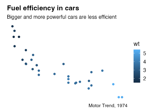
请注意,所有被保留的元素在这幅图和上一幅图中看起来都是一样的。
如果我们使用 theme_nothing() 绘制相同的曲线图,那么除了曲线图面板之外的所有元素都会被移除,包括标题和图例。
p + theme_nothing()
ggdraw()和 plot_grid() 使用该主题来绘制外围画布。
图形对齐(控制长宽等可对齐)
在R语言中,有几个包可以用来对齐图形。除了cowplot外,最广泛使用的包括egg和patchwork。这些包采用了略有不同的方法来对齐图形,各自的方法有不同的优势和劣势。
虽然egg和patchwork在对齐和排列图形时采用相同的方式,但cowplot则独立于图形的排列对齐图形。这使得能够先对齐图形,然后再分别重现它们,甚至可以将它们叠加在一起
library(ggplot2)
library(cowplot)

p1 <- ggplot(mtcars, aes(disp, mpg)) +
  geom_point()
p2 <- ggplot(mtcars, aes(disp, hp)) +
  geom_point()
p1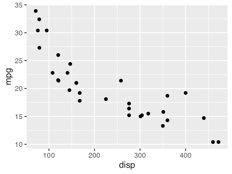
p2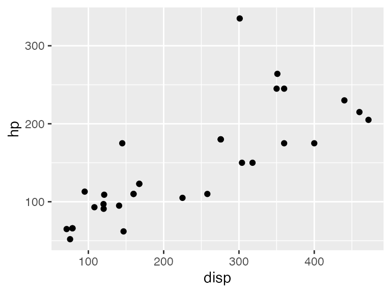
哪怕两个绘图的 x 轴相同,但第一个绘图区域的宽度略大于第二个,因为 y 轴标签的长度不同。在文档中,如果两个绘图相互靠近显示,绘图宽度的这些差异可能会影响美观。我们可以通过垂直对齐两个绘图,然后分别绘制它们来解决这个问题。
aligned <- align_plots(p1, p2, align = "v")
ggdraw(aligned[[1]])
ggdraw(aligned[[2]])
垂直对齐(align = "v")是指任何垂直参考线(如左右 y 轴线)在绘图中对齐。相比之下,水平对齐(align = "h")则是对齐水平参考线。这两种对齐方式可以单独使用(align = "v" 或 align = "h"),也可以组合使用(align = "vh" 或 align = "hv")。
如果我们想先对齐再排列图形,可以调用 plot_grid(),并为其提供一个对齐参数。plot_grid() 函数会调用 align_plots() 对齐绘图,然后排列它们。
plot_grid(p1, p2, ncol = 1, align = "v")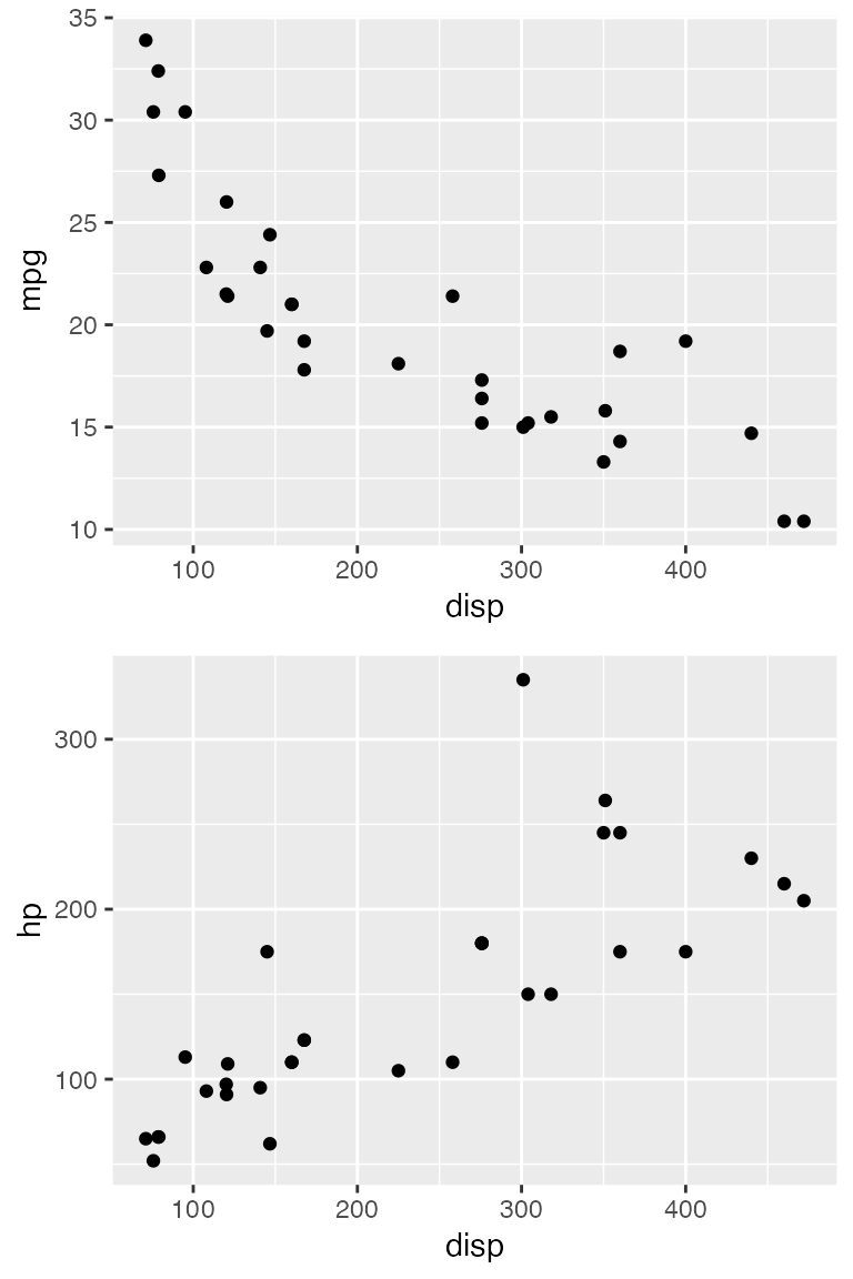
按坐标轴对齐
上述垂直和水平对齐方式会尝试对齐所有绘图中的每个垂直或水平元素。换句话说,坐标轴标题相互对齐,坐标轴刻度相互对齐,绘图面板相互对齐,等等。这种对齐方法只有在所有绘图具有完全相同的元素时才有效。因此,举例来说,如果我们试图将一个有分面的绘图与一个没有分面(facet)的绘图对齐,这种方法就会失败。
p1 <- ggplot(mtcars, aes(disp, mpg)) +
  geom_point() +
  theme_minimal_grid(14) +
  panel_border(color = "black")

p2 <- ggplot(mtcars, aes(factor(vs))) +
  geom_bar() +
  facet_wrap(~am) +
  scale_y_continuous(expand = expansion(mult = c(0, 0.1))) +
  theme_minimal_hgrid(12) +
  panel_border(color = "black") +
  theme(strip.background = element_rect(fill = "gray80"))

plot_grid(p1, p2, align = "h", rel_widths = c(1, 1.3))
##   Warning: Graphs cannot be horizontally aligned unless the axis parameter is
##  set. Placing graphs unaligned.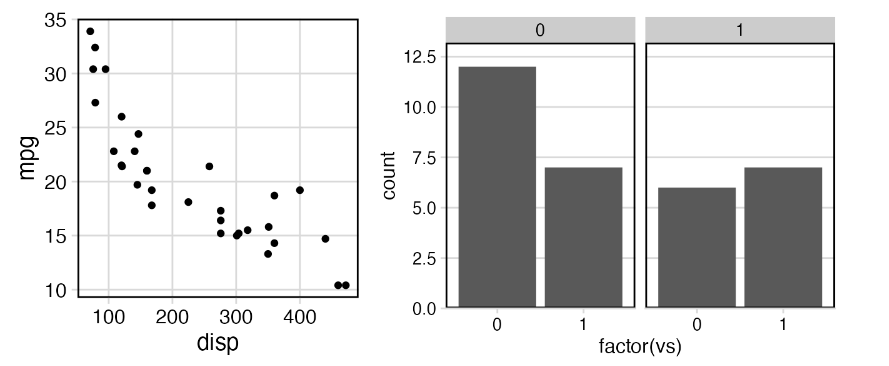
我们会收到无法对齐绘图的警告,因此绘制的绘图没有对齐。要对齐这些曲线图,我们需要告诉 align_plots() 函数曲线图的哪些部分应该对齐。有两种选择,而且都很有意义。首先,我们可以只对齐底轴(axis = "b")。
plot_grid(p1, p2, align = "h", axis = "b", rel_widths = c(1, 1.3))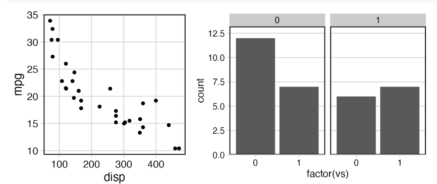
其次,我们可以同时对齐底部和顶部轴线(axis = "bt")
plot_grid(p1, p2, align = "h", axis = "bt", rel_widths = c(1, 1.3))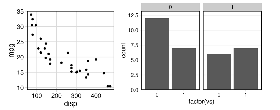
一般来说,轴参数告诉 align_plots() 函数只对齐特定的轴。它可以理解任意组合的 "t"(顶)、"r"(右)、"b"(底)和 "l"(左)值。
在第二个例子中,我将展示即使两个绘图包含相同数量的元素,按坐标轴对齐也是非常有用的。请看这两个垂直排列的图,首先显示的是 mpg 数据集中不同类别的汽车数量,其次是每个类别的平均城市 mpg 与该类别汽车数量的散点图。
library(dplyr)
library(forcats)

city_mpg <- mpg %>%
  mutate(class = fct_lump(class, 4, other_level = "other")) %>%
  group_by(class) %>%
  summarize(
    mean_mpg = mean(cty),
    count = n()
  ) %>% mutate(
    class = fct_reorder(class, count)
  )

p1 <- ggplot(city_mpg, aes(class, count)) +
  geom_col() +
  ylim(0, 65) +
  coord_flip()

p2 <- ggplot(city_mpg, aes(mean_mpg, count)) +
  geom_point()

plot_grid(p1, p2, ncol = 1, align = 'v')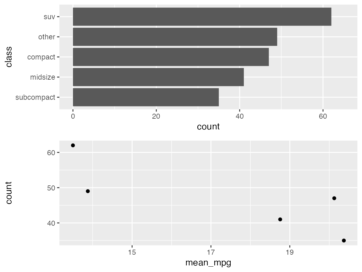
由于第一幅图的 y 轴标签很长,因此第二幅图的 y 轴标题与轴标签相距甚远。这看起来很奇怪。最好将坐标轴标题移近标签。我们可以通过按轴对齐来做到这一点。我这里只对齐左轴。对齐左轴和右轴会产生相同的结果。
plot_grid(p1, p2, ncol = 1, align = 'v', axis = 'l')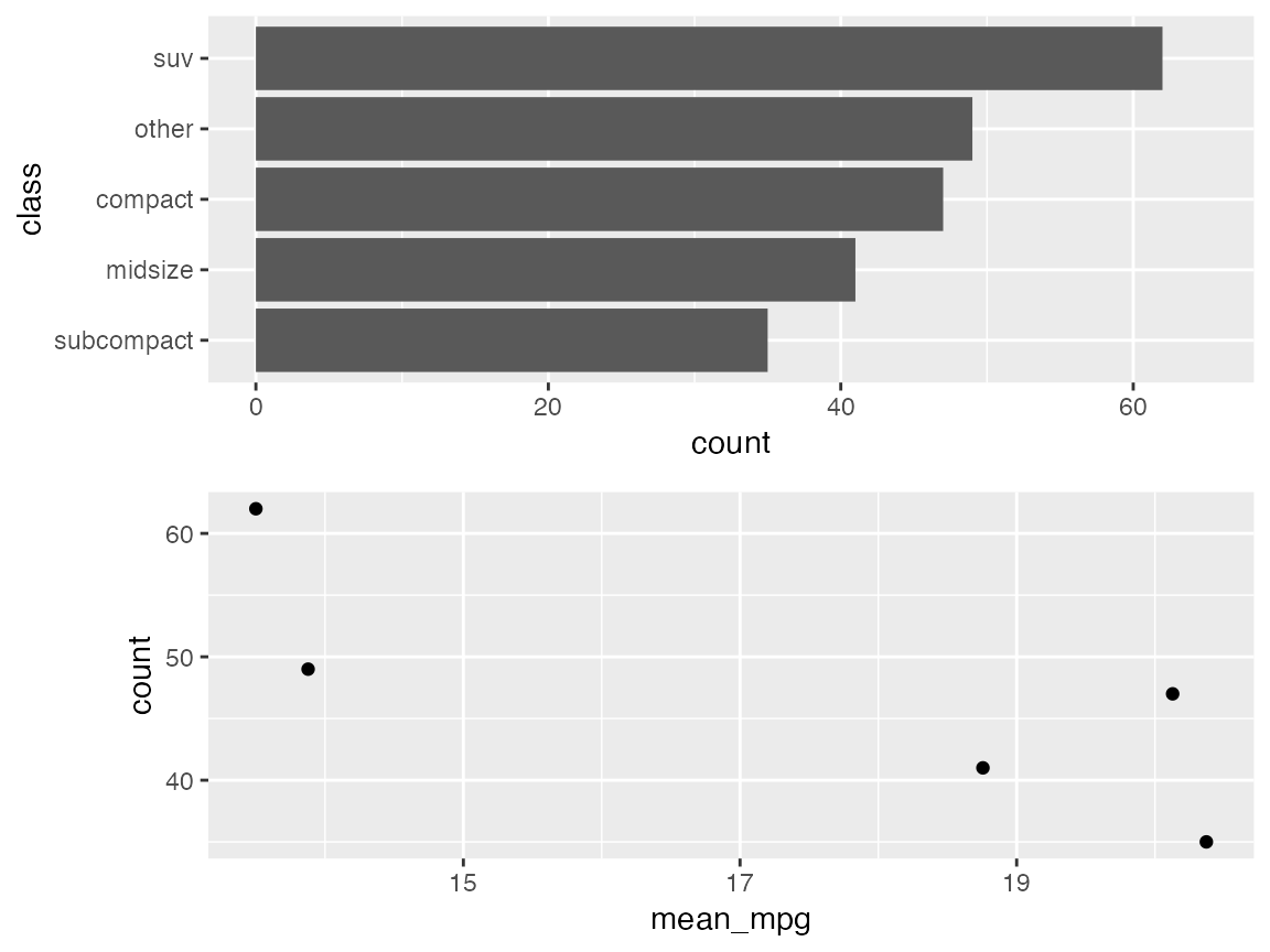
最后,我将分别绘制两幅图,然后将它们叠加在一起。首先,让我们再次绘制 mpg 数据集中不同级别汽车数量的柱状图。
city_mpg <- city_mpg %>%
  mutate(class = fct_reorder(class, -mean_mpg))

p1 <- ggplot(city_mpg, aes(class, count)) +
  geom_col(fill = "#6297E770") +
  scale_y_continuous(
    expand = expansion(mult = c(0, 0.05)),
    position = "right"
  ) +
  theme_minimal_hgrid(11, rel_small = 1) +
  theme(
    panel.grid.major = element_line(color = "#6297E770"),
    axis.line.x = element_blank(),
    axis.text.x = element_blank(),
    axis.title.x = element_blank(),
    axis.ticks = element_blank(),
    axis.ticks.length = grid::unit(0, "pt"),
    axis.text.y = element_text(color = "#6297E7"),
    axis.title.y = element_text(color = "#6297E7")
  )
p1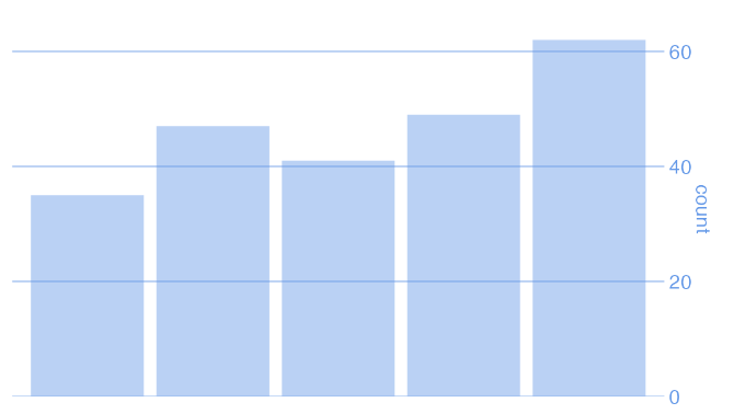
现在,让我们用散点图来绘制平均城市英里数与汽车级别的关系。
p2 <- ggplot(city_mpg, aes(class, mean_mpg)) +
  geom_point(size = 3, color = "#D5442D") +
  scale_y_continuous(limits = c(10, 21)) +
  theme_half_open(11, rel_small = 1) +
  theme(
    axis.ticks.y = element_line(color = "#BB2D05"),
    axis.text.y = element_text(color = "#BB2D05"),
    axis.title.y = element_text(color = "#BB2D05"),
    axis.line.y = element_line(color = "#BB2D05")
  )
p2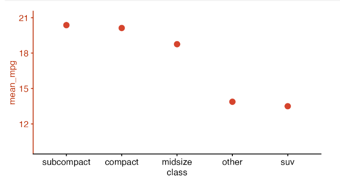
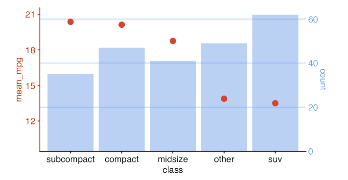
现在,我们对齐这两幅图,然后将它们叠加在一起。这样绘制的曲线图具有双轴,通常不鼓励绘制这样的曲线图。我在这里举这个例子只是为了说明,当绘图对齐和绘图放置分开时,我们可以实现哪些类型的效果。
叠加绘图
cowplot 软件包提供了一些函数,用于绘图和叠加绘图。通过这些函数,我们可以为图形添加任意注释或背景,将图形置于其他图形内部,以更复杂的布局排列图形,或将来自不同图形系统(ggplot2, grid, lattice, base)的图形组合在一起。该功能建立在 ggplot2 的基础之上,也就是说,生成的图形是 ggplot2 对象,可以像普通 ggplot2 图形一样进行修改、扩展和输出。
添加背景注释(水印也可以)
我们从一些简单的注释开始,例如标签或水印。让我们从 mpg 数据集的基本图开始。
library(ggplot2)
library(cowplot)

p <- ggplot(mpg, aes(displ, cty)) +
  geom_point() +
  theme_minimal_grid(12)

p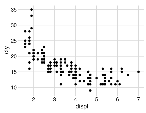
接下来,我们要给这幅图加上 "draft "的水印。为此,我们通过调用 ggdraw() 将绘图包裹到绘图环境中,然后通过各种 draw_*() 函数添加注释。
ggdraw(p) +
  draw_label("Draft", color = "#C0A0A0", size = 100, angle = 45)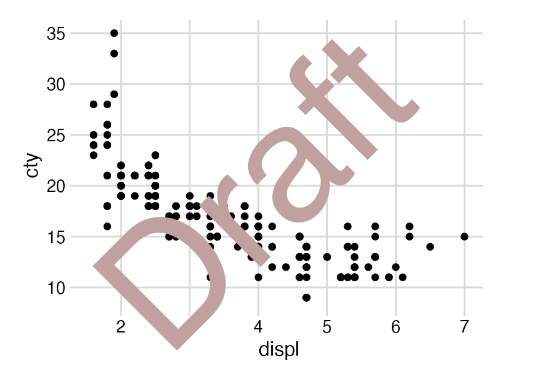
ggdraw(p)的作用是捕捉绘图的快照,使绘图有效地转化为图像,然后将图像绘制到新的 ggplot2 画布中,不显示坐标轴或背景网格。draw_* 函数只是常规几何图形的包装器。因此,在上面的示例中,我们可以使用 geom_text(),而不是 draw_label()。
ggdraw(p) +
  geom_text(
    data = data.frame(x = 0.5, y = 0.5, label = "Draft"),
    aes(x, y, label = label),
    hjust = 0.5, vjust = 0.5, angle = 45, size = 100/.pt,
    color = "#C0A0A0",
    inherit.aes = FALSE
  )
不过,请注意调用 geom_text() 时要啰嗦得多。此外,geom_text() 以毫米为单位解释字体大小,因此如果我们想以更传统的点为单位指定字体大小,就需要除以 .pt。相比之下,draw_label() 会为我们执行这种转换,因此我们可以直接以点为单位指定字体大小。
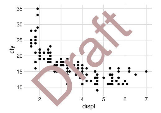
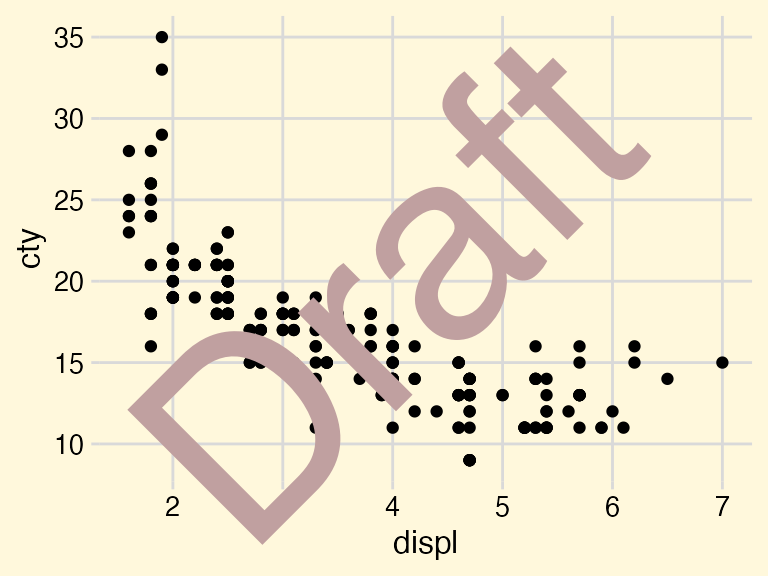
由于 ggdraw() 建立在 ggplot2 的基础之上,因此我们可以像处理 ggplot2 图形一样处理它的输出。例如,我们可以使用 theme() 函数来更改背景颜色。
ggdraw(p) +
  draw_label("Draft", color = "#C0A0A0", size = 100, angle = 45) +
  theme(
    plot.background = element_rect(fill = "cornsilk", color = NA)
  )
我们还可以通过 ggsave() 以标准方式保存注释图。
draft <- ggdraw(p) +
  draw_label("Draft", color = "#C0A0A0", size = 100, angle = 45)

ggsave("draft.pdf", draft)(不过,cowplot 软件包提供了ggsave()的替代函数 save_plot(),可以更方便地保存大小合适的图,尤其是在制作复合图时)。详情请参见 save_plot() 文档)。
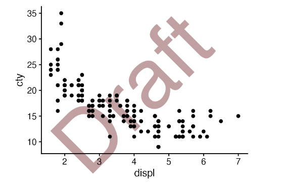
通常,我们可能希望注释位于绘图下方而不是上方。我们可以先用 ggdraw() 设置一个空图层,然后添加标注,再用 draw_plot() 添加绘图,这样就可以实现这一效果。
ggdraw() +
  draw_label("Draft", color = "#C0A0A0", size = 100, angle = 45) +
  draw_plot(p)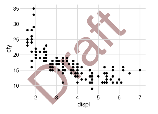
这就要求绘图具有透明背景,而所有 cowplot 主题都符合这一要求。相比之下,ggplot2 主题则不一定如此。例如,如果我们将情节的主题改为 theme_classic(),底层标签就会被主题的白色背景所隐藏。
ggdraw() +
  draw_label("Draft", color = "#C0A0A0", size = 100, angle = 45) +
  draw_plot(
    p + theme_classic()
  )
cowplot 主题 theme_half_open() 没有这种限制。
ggdraw() +
  draw_label("Draft", color = "#C0A0A0", size = 100, angle = 45) +
  draw_plot(
    p + theme_half_open(12)
  )
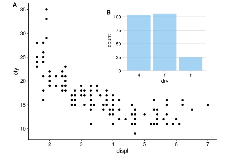
嵌入图形
Draw_plot() 函数还允许我们在画布上任意位置放置任意大小的绘图。这对于将子图组合成非简单网格的布局非常有用,例如在较大的图形中绘制插入图。
inset <- ggplot(mpg, aes(drv)) +
  geom_bar(fill = "skyblue2", alpha = 0.7) +
  scale_y_continuous(expand = expansion(mult = c(0, 0.05))) +
  theme_minimal_hgrid(11)

ggdraw(p + theme_half_open(12)) +
  draw_plot(inset, .45, .45, .5, .5) +
  draw_plot_label(
    c("A", "B"),
    c(0, 0.45),
    c(1, 0.95),
    size = 12
  )
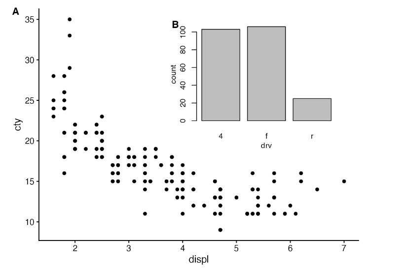
该功能不仅限于 ggplot2 绘图。它也适用于基本图形。
inset <- ~{
  counts <- table(mpg$drv)
  par(
    cex = 0.8,
    mar = c(3, 3, 1, 1),
    mgp = c(2, 1, 0)
  )
  barplot(counts, xlab = "drv", ylab = "count")
}

ggdraw(p + theme_half_open(12)) +
  draw_plot(inset, .45, .45, .5, .5) +
  draw_plot_label(
    c("A", "B"),
    c(0, 0.45),
    c(1, 0.95),
    size = 12
  )
绝对定位
默认情况下,ggdraw() 使用的坐标系统使用的是 x 和 y 坐标从 0 到 1 的相对坐标。不过,有时我们需要将图形元素放置在绝对单位上,例如距离左边界正好 1 英寸。我们可以通过绘制_grob()函数支持的网格图形系统来实现。例如,下面的代码会生成一个宽度和高度均为 1 英寸的蓝色正方形,它正好位于绘图区域左侧边框 1 英寸处和顶部边框 1 英寸处。
library(grid)
rect <- rectGrob(
  x = unit(1, "in"),
  y = unit(1, "npc") - unit(1, "in"),
  width = unit(1, "in"),
  height = unit(1, "in"),
  hjust = 0, vjust = 1,
  gp = gpar(fill = "skyblue2", alpha = 0.5)
)

ggdraw(p) +
  draw_grob(rect)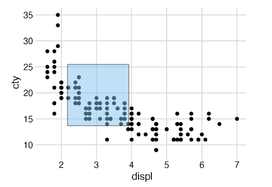
如果我们以不同的尺寸重新生成该图,蓝色方块将保持在相同的绝对位置,并保留其绝对尺寸。
ggdraw(p) +
  draw_grob(rect)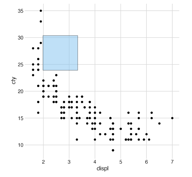
连接绘图(plot)和图片(image)
绘图层还通过函数 draw_image()支持图像。该函数需要安装 magick 软件包,可以获取多种不同格式的图像,并将其与绘图相结合。例如,我们可以使用图像作为绘图背景:
library(magick)
library(dplyr)
library(forcats)

img <- system.file("extdata", "cow.jpg", package = "cowplot") %>%
  image_read() %>%
  image_resize("570x380") %>%
  image_colorize(35, "white")

p <- PASWR::Cows %>%
  filter(breed != "Canadian") %>%
  mutate(breed = fct_reorder(breed, butterfat)) %>%
  ggplot(aes(butterfat, fill = breed)) +
  geom_density(alpha = 0.7) +
  scale_fill_grey() +
  coord_cartesian(expand = FALSE) +
  theme_minimal_hgrid(11, color = "grey30")

ggdraw() +
  draw_image(img) +
  draw_plot(p)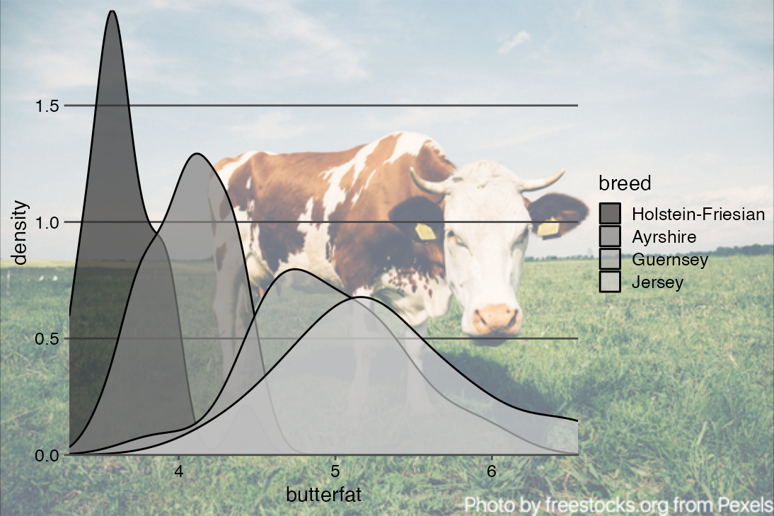
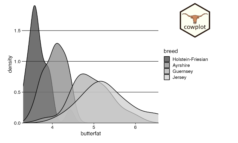
我们还可以将图像作为logo添加到绘图中。除了使用 hjust 和 vjust 外,我们还使用 halign 和 valign 使图像与右上角平齐。
logo_file <- system.file("extdata", "logo.png", package = "cowplot")

ggdraw() +
  draw_plot(p) +
  draw_image(
    logo_file, x = 1, y = 1, hjust = 1, vjust = 1, halign = 1, valign = 1,
    width = 0.15
  )
混合不同绘图框架的图(如ggplot2和base)
除 ggplot2 对象外,所有将绘图对象作为输入的 cowplot 函数(ggdraw()、draw_plot()、plot_grid())都可以处理多种不同类型的对象。最重要的是,它们可以处理使用基本 R 图形生成的绘图。不过,只有安装了 gridGraphics 软件包才能使用这一功能。
作为第一个示例,我们用 ggdraw() 绘制一个基本图形,并用 ggplot2 主题机制设计背景样式
library(ggplot2)
library(cowplot)

# define a function that emits the desired plot
p1 <- function() {
  par(
    mar = c(3, 3, 1, 1),
    mgp = c(2, 1, 0)
  )
  boxplot(mpg ~ cyl, xlab = "cyl", ylab = "mpg", data = mtcars)
}

ggdraw(p1) +
  theme(plot.background = element_rect(fill = "cornsilk"))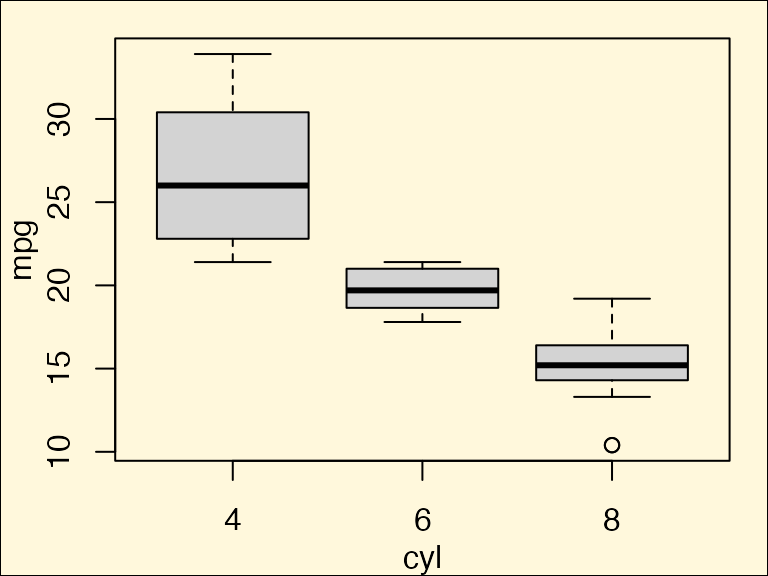
添加一个logo
logo_file <- system.file("extdata", "logo.png", package = "cowplot")

ggdraw() +
  draw_image(
    logo_file,
    x = 1, width = 0.1,
    hjust = 1, halign = 1, valign = 0
  ) +
  draw_plot(p1)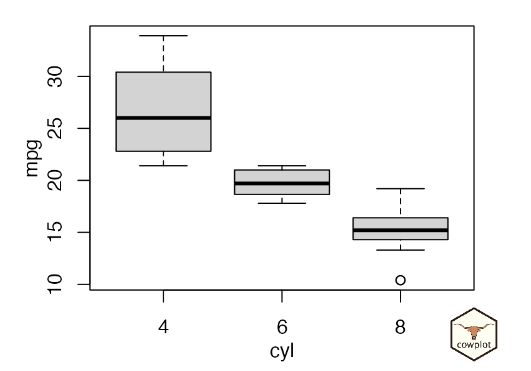
我们还可以在绘图网格中并排绘制基础图形和 ggplot2 图形。
p2 <- ggplot(data = mtcars, aes(factor(cyl), mpg)) + geom_boxplot()
plot_grid(p1, p2)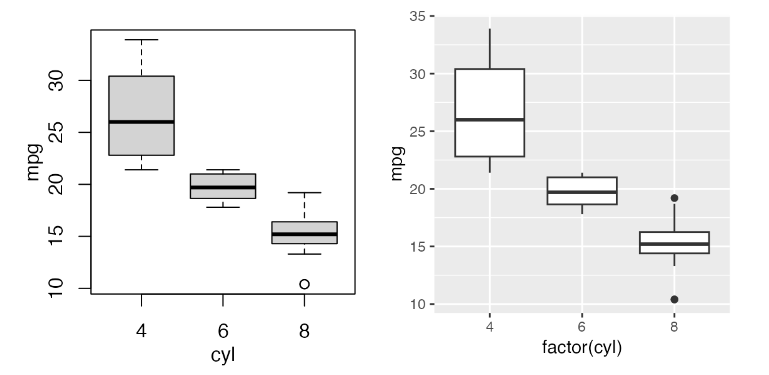
R 基本图可以以函数的形式存储,这些函数可以发出所需的图(如上所示),也可以以记录图的形式存储,还可以使用方便的公式界面。
要创建记录图形,我们首先要绘制基本图形,然后用 recordPlot() 将其记录下来,最后再用 ggdraw() 绘制。
# create base R plot
par(mar = c(3, 3, 1, 1), mgp = c(2, 1, 0))
boxplot(mpg ~ cyl, xlab = "cyl", ylab = "mpg", data = mtcars)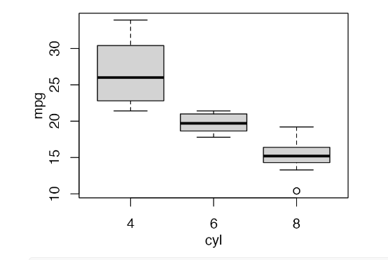
# record previous base R plot and then draw through ggdraw()
p1_recorded <- recordPlot()
ggdraw(p1_recorded)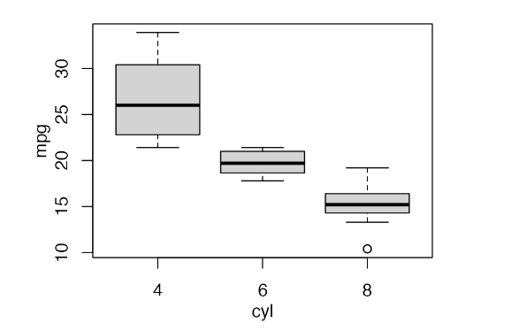
我们可以在公式中存储任意复杂的绘图代码,只需将其括入大括号中即可。
# store base R plot as formula
p1_formula <- ~{
  par(
    mar = c(3, 3, 1, 1),
    mgp = c(2, 1, 0)
  )
  boxplot(mpg ~ cyl, xlab = "cyl", ylab = "mpg", data = mtcars)
}
ggdraw(p1_formula)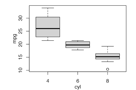
同样支持 lattice graphics 和 grid grobs.
# base R
p1 <- ~{
  par(
    mar = c(3, 3, 1, 1),
    mgp = c(2, 1, 0)
  )
  boxplot(mpg ~ cyl, xlab = "cyl", ylab = "mpg", data = mtcars)
}

# ggplot2
p2 <- ggplot(data = mtcars, aes(factor(cyl), mpg)) + geom_boxplot()

# lattice
library(lattice)
p3 <- bwplot(~mpg | cyl, data = mtcars)

# elementary grid graphics objects
library(grid)
p4 <- circleGrob(r = 0.3, gp = gpar(fill = "skyblue"))

# combine all into one plot
plot_grid(p1, p2, p3, p4, rel_heights = c(.6, 1), labels = "auto")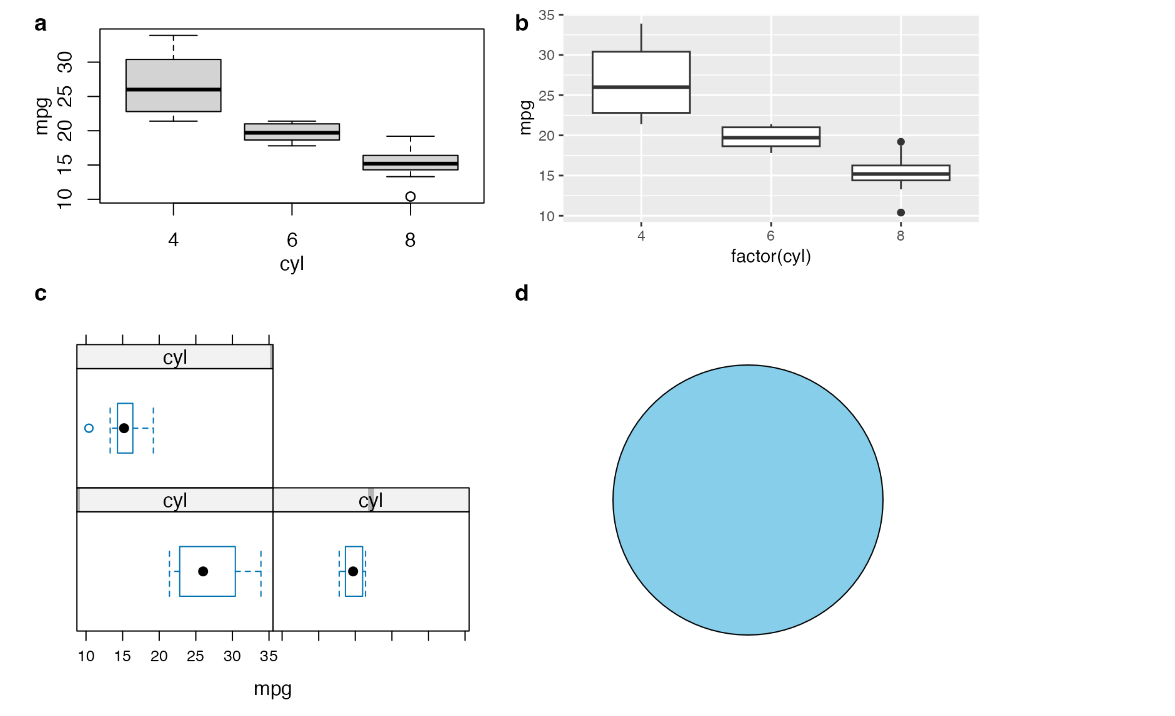


阅读时间暴长的推文